What Hermès’ new London Maison reveals about atmosphere, identity and why visual consistency is the wrong brief for retail interior design.
When Hermès opened its new Maison on Bond Street this week, the numbers alone were enough to prompt a double-take. Six Grade II listed buildings. Five floors. Fifty-five rooms. Four elevators. Over 2,000 square metres of retail space spread across a maze of Georgian, Victorian and Edwardian architecture, none of it built to connect.
The design team at RDAI, led by architect Denis Montel, had every reason to impose a single visual language and bring the whole thing into line. They didn’t. Instead, Montel made a decision that most retail briefs would never permit: he let the buildings disagree with each other.
Each level has its own colour identity. Each métier Hermès has sixteen occupies rooms that shift in atmosphere and material as you move through them. Where the architecture changed height, ceiling height, floor level, the design response was not to smooth the difference but to name it. “Instead of trying to harmonise,” Montel said, “we took the opposite.” The eccentricity was the point. The contrast was the experience.
Most retail interiors are briefed in the opposite direction. Consistency is treated as professionalism. A single material palette, a single tone of light, a single register from threshold to back wall. It reads as considered. It also reads as flat.
Why Retail Spaces That Don’t Match Feel More Considered Than Spaces That Do
The assumption behind a consistent retail scheme is that the customer needs visual continuity to feel comfortable. Remove the friction, the argument goes, and the customer relaxes. Relaxed customers spend more time. More time means more sales.
The problem is that continuity and comfort are not the same thing. A space with no variation is a space with no incident. The customer moves through it without pausing, because there is nothing to pause for. The eye adjusts quickly to a single atmosphere and once adjusted, stops registering it.
This is familiar to anyone who has walked through a large retail chain and felt, somewhere around the third fixture, that they have already seen everything. The space is consistent. It is also, in the design sense, over. There is nowhere left to discover.
Contrast does something different. It creates conditions for attention. A room that feels different from the one before it asks the customer to arrive again to re-read the space, to slow down, to notice. That noticing is the beginning of engagement. Retail designers talk about dwell time as a commercial metric. What drives dwell time is not comfort alone. It is curiosity.
Kando Studio has observed this pattern across retail fit-outs in London: the spaces that generate the longest dwell times are rarely the most visually resolved. They are the ones where something unexpected happens a material shift, a change in ceiling height, a pocket of warmth tucked behind a cooler, more pared-back display area. The customer moves toward it without quite knowing why. This is where retail design starts with behaviour, not fixtures and why the layout decision always precedes the material one.
The most effective retail interiors are not visually consistent. They are spatially coherent — and those are entirely different things.
What Happens When a Customer Moves Between Rooms That Feel Different
At the Hermès Maison Bond Street, colour is assigned by métier and changes level by level. Move from the silk rooms to leather goods and the atmosphere shifts deliberately, even abruptly. Montel described some of the transitions as intentionally clashing. That choice would be indefensible in a conventional retail brief. In practice, it is what makes the building feel alive.
Each threshold becomes an event. The customer does not drift through the space, they arrive somewhere. That act of arriving, repeated across fifty-five rooms, accumulates into an experience that feels worth the time it takes.
At boutique scale, the principle holds. A 60-square-metre independent retailer in London, Kensington, or Richmond does not have six buildings to work with. It may have two rooms, or a mezzanine, or a recess behind the main display. The question is the same: does the spatial sequence give the customer somewhere to go, or does it ask them to take in everything from the door?
A low table beside a window. A change in floor material at the point where browsing becomes considering. A wall finished differently from the one opposite it. These are not decorative decisions. They are spatial ones, and their effect on customer behaviour is measurable. The customer pauses. They handle the product. They begin to imagine owning it.
None of this requires six Georgian buildings or a budget that runs to bespoke Lancashire wall coverings and hand-finished mineral mortar. It requires a brief that permits the space to have more than one register.
Why Contrast Is Not Inconsistency
he distinction most retail briefs miss is between visual consistency and spatial coherence. A consistent scheme applies the same language throughout. A coherent one has a clear logic and within that logic, allows for variation.
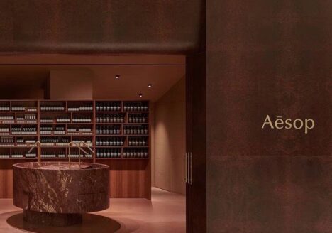
Hermès is coherent. Every material decision, every colour shift is in service of the same idea: that craft has its own world, and moving through it should feel like a journey. The contrast between rooms does not undermine that. It is the argument. The same principle is what makes Aesop’s retail design work is not a visual formula, but a spatial one applied differently in every room.
For smaller retailers, coherence starts with understanding what the space is for before deciding how it should look. A boutique selling objects people will live with for twenty years should feel different from one selling seasonal product. The materiality, the light, the pace of the circulation — all of it communicates something about value before a single product is picked up.
The room that feels different is the one the customer remembers. The threshold they cross into it is the moment the visit becomes an experience rather than a transaction.
The most expensive mistake in retail design is not bad materials or wrong lighting. It is a brief that asks the space to be the same everywhere — and gets exactly what it asked for.
Coherence is not about everything matching. It is about everything meaning something.
Every retail space communicates something before a customer touches a single product. Kando Studio works with boutique brands across retail interior design in London to design interiors where that communication is intentional spatially, materially, and commercially.
Kando Studio works with retail brands across London to create thoughtful interiors that balance spatial coherence, material intelligence and customer experience.
Written by Fariba Soltani, Founder of Kando Studio — kandostudio.com