How atmosphere, material honesty, and hospitality-led retail design shape customer experience in boutique retail interiors.
Most retail stores are designed for visibility. Aesop stores are designed for atmosphere.
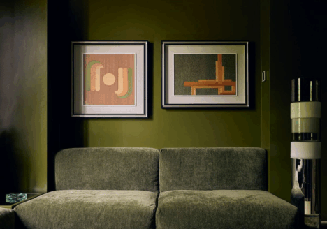
Walk into one – in Marylebone, in Tokyo, in Melbourne – and something shifts before you’ve registered what it is. The lighting is warm and directional rather than the flat retail flood you’ve absorbed without noticing. The surfaces are cool: stone, concrete, brass, aged timber. Sound behaves differently here – there’s a particular acoustic clarity to hard materials that absorb nothing, and Aesop stores lean into it. And there is always a sink.
None of this is decorative. It is a retail interior design strategy built on a precise understanding of how people decide to trust certain products – and how space either earns or undermines that trust before a word is spoken.
What Most Retail Design Gets Wrong
The dominant logic of retail interior design rests on visibility. Products at eye level. Clear sightlines to merchandise. Bright lighting that catches colour and highlights what’s new. The assumption is linear: see it, want it, buy it.
This logic is useful for volume goods. It is not useful for products people live with daily.
A thirty-pound hand wash is not an impulse buy in the way a magazine or a snack is. It is a small but considered decision about what will sit on your bathroom shelf every morning. The person making that choice is not looking for the most visible product in the room. They are looking for the one they trust – and trust is shaped by environment long before it is shaped by product description.
Most boutique retail design overlooks this. Aesop does not.
What the Space Is Actually Doing
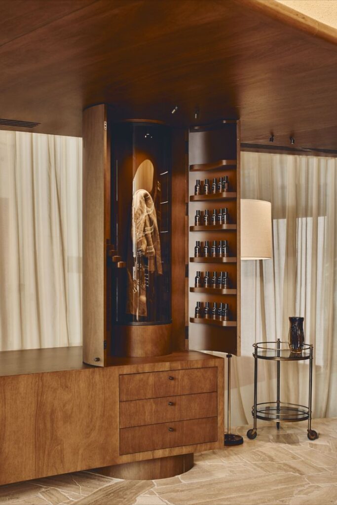
Every Aesop store is designed in collaboration with a local architect, and every one is materially distinct. Some use raw concrete and reclaimed timber. Others favour Corten steel, terrazzo, or locally sourced stone. The product remains constant; the architecture responds to place.
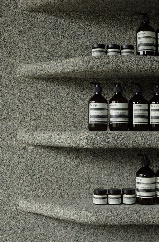
The material choices do something specific. Stone and concrete don’t date. Brass patinates, it ages into something rather than away from something. Timber carries grain and warmth even when it’s structural. These are materials that feel built rather than dressed, and that distinction registers physically before it registers consciously. You read a room with your hands before you read it with your eyes.
The lighting reinforces this. Warm directional spots placed low and close, rather than ceiling floods that flatten everything. In most retail environments, bright even lighting signals openness, nothing hidden, nothing uncomfortable. Aesop stores use light the way residential interiors do: to create warmth, to make certain surfaces glow, to give the room a quality closer to candlelight than to commerce.
The products themselves are arranged without urgency. They sit on shelves, sometimes behind you as you enter. The brown bottles are legible but not insistent. The store does not shout. The customer must slow down to read it.
The threshold is deliberate. You step in from street pace and the room asks you, quietly, to adjust.
This is spatial design working on behaviour, not dramatically, but persistently. The pace of the space changes your pace. That is not an accident.
Atmosphere Is the Argument
Here is what Aesop’s retail design says plainly, even if the industry rarely does: the decision to trust a product often happens before the product is touched.
It happens in the quality of the floor underfoot. The weight of a tap. The temperature of a counter. The warmth of light above a sink. Material honesty, the use of real materials that read as themselves rather than as substitutes for something else – creates a spatial credibility that no graphic, no window display, and no promotional message can manufacture.
This matters most for products sold at a premium that require daily intimacy. The bathroom, the kitchen, the bedside table. These are not spaces of spectacle. They are spaces of routine, and the objects inside them become part of that routine in ways that make provenance matter.
Aesop stores don’t sell products into that intimacy. They demonstrate it first, in the space itself. The store is the argument.
The Sink, and What It Costs
The sink is the clearest expression of this logic. It is not theatre, though it has theatrical qualities. It is a structural commitment to a slower kind of transaction.
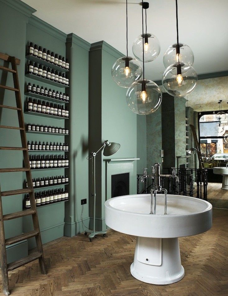
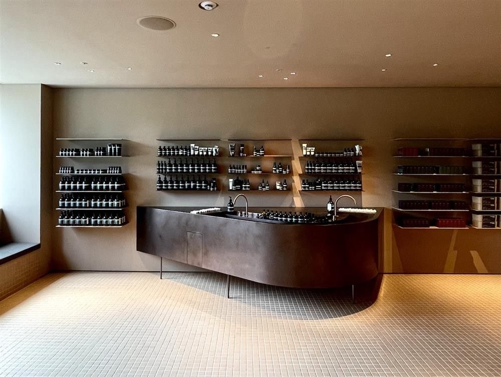
When a member of staff offers to wash your hands, you are not being sold to. You are being hosted. The products are demonstrated through use ,texture, scent, lather ,without being explained. This takes five minutes at minimum. It requires the customer to stop completely.
For impulse purchases, this kills sales. But Aesop isn’t selling impulse buys. The sink ritual acknowledges that the decision is worth taking time over, and it communicates something subtler: it is fine to be here without buying anything. Some customers do exactly that. Others come back the following week. A few become regulars across years.
The transaction is not optimised per visit. It is optimised across a relationship. That requires the space to feel genuinely uncommercial, even while everything in it is the result of careful commercial decision-making. That is a difficult balance to achieve in retail interior design, and it requires refusing most of the conventions the industry defaults to.
What This Means for Boutique Retail Design
The specific model isn’t transferable wholesale. Not every retailer can commission a bespoke store for each location, and not every product justifies five minutes at a sink.
But the underlying principle applies far more broadly. For any boutique retail space, a specialist food shop, an independent pharmacy, a considered clothing store, the question worth asking is not: how visible is the product? It is: does this space create the conditions in which a thoughtful purchase becomes possible?
That question changes what you design for. The brief shifts from display to atmosphere. Lighting becomes a spatial decision rather than a functional one, material selection a question of message rather than budget. And the threshold , the moment someone steps from street to interior, becomes worth designing with the same care as the product display itself.
These are the considerations that distinguish retail interior design that builds loyalty from retail interior design that merely processes transactions.
The store that doesn’t feel like it’s selling you something often sells most effectively.
Material honesty, the sink ritual, the refusal to display products prominently, these are not affectations. They are a coherent spatial strategy for selling expensive everyday objects to people who have options and some understanding of what quality feels like.
The lesson isn’t to copy Aesop. It’s to ask what your space is communicating before the product is ever touched and whether that communication earns the transaction you’re hoping for.
Good retail design is rarely only about display. It shapes how people move, pause, and experience a space. Kando Studio designs thoughtful retail interiors in London that balance atmosphere, functionality, and customer experience.
Written by Fariba Soltani, founder of Kando Studio — kandostudio.com