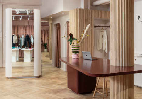
I didn’t set out to specialise in retail interior design in Marylebone. It happened one shop at a time.
For the same independent fashion brand, we had already created pop-ups in Mayfair and Sloane Square before Marylebone became an important part of its retail story. We went on to design four pop-ups there, three on Marylebone Lane and one at St Christopher’s Place, before eventually creating a permanent store on Marylebone Lane.
Each space was different. Each came with its own architecture, budget and constraints. But perhaps the biggest challenge was often time.
On some of the pop-ups, we were given the lease to the property barely a week before we needed to get moving. Suddenly, dozens of decisions that would ordinarily be considered over weeks or months had to be weighed up almost simultaneously. And when you are designing for an independent brand, those decisions matter.
When Every Decision Has a Cost
Opening a shop in central London is expensive. For an independent business, the investment can be substantial, particularly when the store itself may only exist for a relatively short period.
So the question was never simply, What would look best? It was:
What is worth spending money on here?
Do we change the floor or work with it?
Do we invest in bespoke display or design something that can move with us?
Which part of the shop needs to make the strongest impression?
What will customers see from the street?
What can we leave completely alone?
When time is short, you don’t get the luxury of exploring every possibility.
You have to weigh them up, understand what each decision gives you in return, and move.
Good retail design isn’t about spending everywhere. It’s about knowing where the money will work hardest.
That became particularly important with the pop-ups.
A Pop-Up Is Not Just a Smaller Permanent Shop
There is something wonderfully unforgiving about designing a temporary store. The programme is compressed. The budget has to work hard. And you often inherit a space that was never intended for what you’re asking it to do.
You can’t solve every problem with new construction. So you start looking more carefully.
Where does the customer look when they enter?
What needs to be visible from outside?
Where should the eye travel next?
Where will people naturally stop?
And what can be adapted rather than replaced?
Those constraints can be surprisingly useful.
They force you to distinguish between what a shop genuinely needs and what you simply want to add.
Why We Kept Coming Back to Marylebone
After working in Mayfair and Sloane Square, Marylebone offered something slightly different.
We loved the neighbourhood itself. It has an unusual mix of residents, visitors and tourists from many different nationalities, but it still retains the feeling of a neighbourhood rather than a conventional shopping district. More importantly for the brand, we found people there receptive to independent businesses. There is a culture of wandering, discovering and stepping into smaller shops simply because something catches your attention and for an independent retailer, that’s incredibly valuable.
The store doesn’t exist in isolation. The street outside is part of the customer experience.
Choosing where a shop lives can be as important as deciding what happens inside it.
That was one of the reasons Marylebone continued to make sense for us.
Each Shop Became a Prototype for the Next
The great advantage of designing repeatedly for the same brand is that you begin to learn from the spaces themselves. After a shop opens, drawings become reality, you see where customers naturally pause, which displays attract attention, where circulation becomes difficult, What staff need behind the counter,which ideas earn their cost and which ones don’t.
By the second and third Marylebone pop-ups, we weren’t starting from zero, we were carrying knowledge from one shop into the next, some ideas stayed, others disappeared and new ones emerged because the building demanded something different.
That’s very different from developing a retail formula and reproducing it.
A strong retail identity doesn’t need every shop to look the same. It needs every shop to feel like the same brand.
The Building Always Has an Opinion
This became particularly apparent in Marylebone, the shops rarely arrive as anonymous white boxes.
Existing buildings bring their own windows, proportions, thresholds, ceiling heights, awkward corners and sometimes elements you would never have chosen yourself. but those aren’t necessarily problems. I’ve become increasingly wary of retail interiors that could be picked up and placed anywhere. If the same shop could exist unchanged in Marylebone, Dubai or an airport terminal, something has probably been lost-the architecture gives you information. Good design begins by deciding what to listen to.
Temporary Doesn’t Have to Feel Temporary
There is also an assumption that because a shop is a pop-up, it should somehow look temporary – I don’t agree.
Temporary describes how long the shop exists, not the quality of the experience. A limited budget can still produce character, a single colour used confidently can do more than five expensive finishes. Good lighting can transform the perceived value of the products beneath it. A well-positioned display can work harder than filling every available wall. And sometimes the most effective decision is simply recognising what is already good about the space and leaving it alone.
When the investment is significant and the lease is short, every intervention needs a reason.
Then Came the Permanent Store
After four Marylebone pop-ups, designing a permanent store changed the conversation. Suddenly, longevity mattered.
Storage needed to work differently. Materials needed to age well. Lighting, circulation, services and everyday operation justified a different level of investment. But we also had something enormously valuable by then: evidence.
We had watched people shop. We knew more about how the brand behaved physically, how customers moved through the spaces and what the staff actually needed. The permanent store therefore wasn’t simply a bigger or more expensive version of the pop-ups. It was the result of everything we’d learned from them. Read on permanent store here.
What Marylebone Taught Me
Looking back at those projects, I don’t think the biggest lesson was about a particular material, layout or display system, It was about making decisions with clarity.
Retail projects can move incredibly quickly. Sometimes there simply isn’t time to investigate every possible solution, but speed doesn’t make those decisions less important, quite the opposite.
When the cost of opening a shop is significant particularly for an independent brand every square metre needs to contribute something. Every intervention needs to justify itself. And every pound spent needs to help the space, the product or the customer experience.
Designing several stores for the same brand taught me that repetition shouldn’t produce the same answer. It should produce better questions.
Each project should leave you knowing something you didn’t know before, and perhaps that’s the difference between creating a retail look and developing a retail identity, one can be repeated and the other evolves.
If you’re planning a pop-up or permanent retail space and need to make the right decisions quickly, I’d be very happy to hear about it. Start a conversation with Kando Studio.